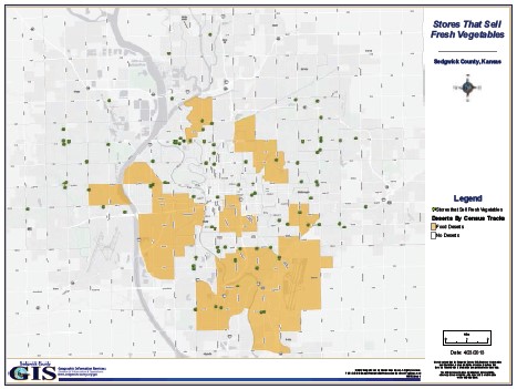
Example #1: Wichita food deserts. Why we should care.

The Wichita Community Food Assessment evaluated the food systems serving the city and their capacity to provide access to healthy, affordable and culturally appropriate foods to all residents. The assessment, entitled Wichita Food Deserts. Why We Should Care., created an inventory of local food resources and identified gaps. The goal of the assessment was to produce recommendations to inform decision-making and new policy to improve community food security.
The first step required developing a description of the community, its food needs and the food systems that serve it. Team members created an inventory of retail food resources within the city limits that includes the prices and availability of certain staple food items.
This report, commissioned by the Health and Wellness Coalition of Wichita, looks at availability as well as financial and geographical access to healthy foods.
Example #2: Mobilizing to Overcome the ‘Geography of Inequality’ in St. Louis: For the Sake of All
In St. Louis, being born in zip code 63105 or zip code 63106 can make all the difference in the path your life takes, including how long you live. That was one of the main findings from the For Sake of All project report released in May 2014. What it highlights is deep structural and systemic changes that need to happen. And that is why Dr. Purnell and his team are looking beyond just health outcomes, but to broader measures like education, poverty, and employment, that can impact life outcomes. Now in its second phase, the project is seeking to mobilize multi-disciplinary teams of business leaders, policy makers, and communities to support the report’s six areas of recommendation for change in St. Louis. Read more.
Example #3: ‘X’ Marks the Spot: Officials Map a Route Out of the Pandemic
As Covid-19 cases rise, governments and organizations around the world are starting to use geospatial data and digital mapping tools to guide their vaccination campaigns. By brandishing brightly colored maps, they are able to pinpoint the exact neighborhoods where cases are rising or where testing rates are lagging. County and city officials are prioritizing neighborhoods with higher levels of social vulnerability and lower vaccination rates, implementing more vaccination sites there and starting community programs to inform people of these high risk areas about the vaccine and dispel any misinformation. Health organizations want their work to include all sorts of essential services, even outside the pandemic, to ensure citizens’ health needs are all being met. Read more.


